Grooveshark
Michael Vroegop
January 2, 2007
homepageV13Mike_home
Andrew Wise
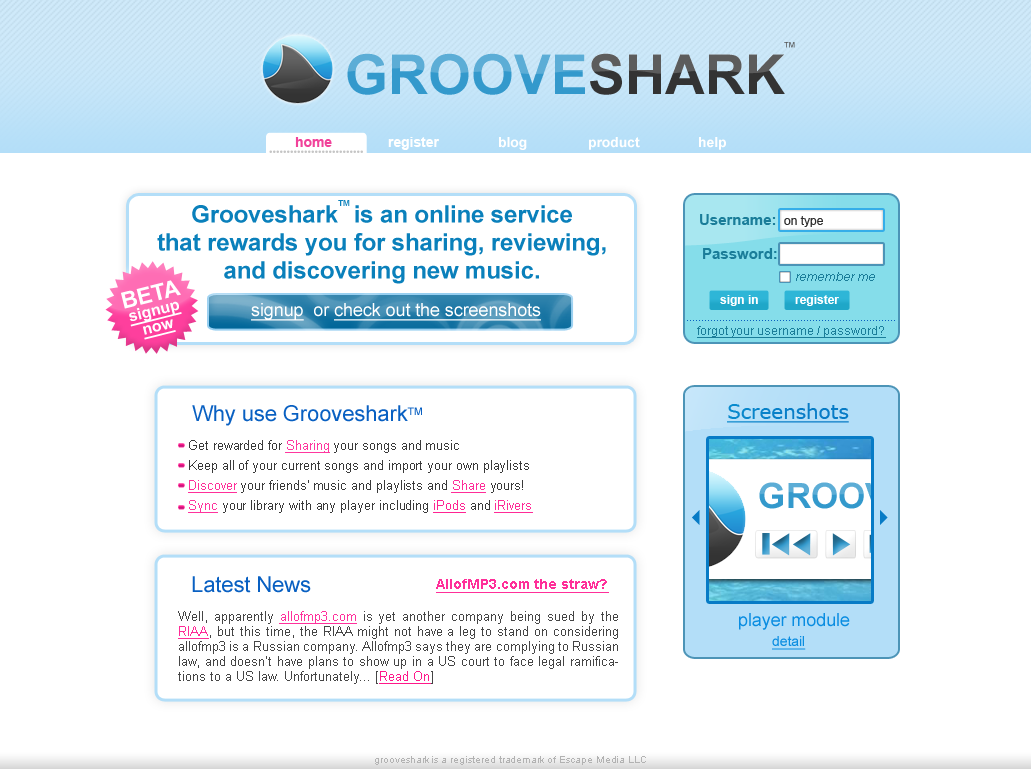
I don't think this top banner looks very good.
The blue is too big -- it should be a lot smaller. Look at the size of the colored area on www.goowy.com -- that looks a lot cleaner.
Andrew Wise
The beta sticker should be on the sign-up area.
Andrew Wise
Screenshot box looks good -- the register box should also be this color or a completely different color for cohesion.
Michael Vroegop
-the blue area was changed in V14.
-As for the beta sticker, I think I
should just change the register button on the sign in area. It's accomplish the
same thing (user looking at the login box wondering how to sign up). The beta
sticker is, in concept, something different- I actually think we should do away
with the "signup or check out the screenshots" button and have just it on the
intro box.
-The register box HAS to stand out visually. Should I go back to
the pink? I've already toned this color down a lot.
Copyright 2007 Grooveshark